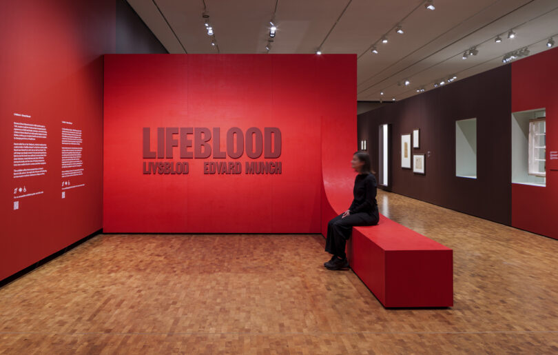

A ground-breaking exhibition that positions fascinating historical objects from the world of medicine alongside contemporary artworks by Edvard Munch is now open at MUNCH, Oslo. The exhibition, curated by Allison Morehead and designed by Nissen Richards Studio (exhibition and graphic design) is called Lifeblood – or ‘Livsblod’ in Norwegian. Running until September 21st, the exhibition considers Munch’s relationship with medicine throughout his lifetime, featuring a chronological approach with different themes coming into focus in each section.
Lifeblood juxtaposes Munch’s art with medical objects and images, such as a baby incubator, glass sputum bottles, vaccine equipment, archival photographs and nursing badges. Together, the artworks and historical items ask provocative questions about modern experiences of health and illness, birth and death and the giving and receiving of care.
Through Munch’s powerful and often visceral work, visitors are invited to feel the universal experience of having a vulnerable body, to think about medicine’s promises to heal ills, and to consider their own experiences of sickness, disability, and health.
When Edvard Munch was born in 1863, very few people in Norway or elsewhere were born or died in a hospital. By the time of his death in 1944, hospital births and deaths were rapidly becoming standard in many places in the world. The artist drew inspiration from his own experiences of sickness, health and the medical environment, as well as those of his family, friends, patrons and various medical practitioners. Both the artist’s father and brother were doctors, although his brother sadly died of pneumonia shortly after completing training.
Munch referred to his own art as his ‘lifeblood’, a kind of medicine that could provide a ‘healthy release’ for both him and his public. Munch saw himself as a sick man as well as a healer and this self-image was deeply rooted in his personal experiences, with both he and his loved ones suffering at various times from chest diseases, mental distress and other afflictions. The artist was also deeply affected by the early death of his sister Sophie, aged just fifteen, from tuberculosis.
Two different visual languages define the exhibition. First, the straightforward thematic language of the show’s content, expressed in the chronology of the exhibition and through the orthogonal lines of the gallery itself, representing the harsher environment of the hospital experience. As a counterpoint, a curved language runs through the exhibition’s central showcases and furniture, acting as a companion to guide the visitor. This represents care-giving, as well as reflecting the curves of the human body.
Enjoying this article? Sign up for our FREE newsletter!
The two languages are also represented through the materials selected for the exhibition, as well as its colour palette. Colour helps define each thematic environment, whilst also being representative of the human body, both inside and outside. Surgical instruments inform the metal inserts in the showcases and display tables.
“We greatly enjoyed working with Curator Allison Morehead on this project” Pippa Nissen, Director of Nissen Richards Studio commented. “Allison’s vision was for a show that gave equal weight to the objects and to the paintings, and we developed a language of display with her that made the objects support the story. Along with the strong, corporeal colour palette for the walls and graphics, we developed furniture designed to make visitors feel aware of their bodies, and the way that they are sitting, so that they question the objects and content in a different way. We worked with contractors to prototype furniture that is really bespoke and able to support unusual perspectives and different ways of viewing the objects.”
The exhibition took accessibility into account at all stages, with specific approaches including freestanding vitrines, so that wheelchair users can sit easily beneath and look down at the content as well as turning room for all wheelchair-users between showcases. There is also a range of different heights of seating throughout. Eye levels were considered from an inclusivity standpoint for all paintings and exhibits, as well as for wall-mounted vitrine objects, as were font sizes for the hierarchy of information on all panels and labels.
“Objects are either displayed in freestanding, purpose-built showcases in the centre of the space or are else set inside existing framed showcases within the full depth of the modular exhibition walls” Amy Kempa, Nissen Richards Studio Associate explained of the approach to object display. “The object showcases display their contents in a very simple and non-hierarchical way, making clear that these are not artworks. Window apertures offer critical viewpoints between thematic environments, allowing visitors to gain a sense of the journey to come. These also create new and intriguing cross-chronological associations.”
Objects and artworks for the exhibition were sourced from multiple places, including MUNCH’s own collection; National Museum, Oslo; Teknisk Museum, Oslo; the Wellcome Collection, London, UK; the German Hygiene Museum, Dresden; the Musée des Moulages, Paris, France; and other regional museums and private individuals in Norway, Denmark, and beyond.