
The Design Museum has announced a display celebrating the work of graphic design pioneer, Margaret Calvert.
The display explores Calvert’s co-designed wayfinding systems for transport networks across the UK and her impact on modern information design, alongside insight into her creative process and ‘play’ projects.
In collaboration with Network Rail, the display also celebrates the launch of the new customised typeface designed by Calvert in collaboration with Henrik Kubel, Rail Alphabet 2. Network Rail
will introduce Rail Alphabet 2 in a new wayfinding system and manual designed by Spaceagency and then roll it out across its managed stations.
With a career spanning over six decades, graphic designer Margaret Calvert has helped shape the nation’s visual identity. Her work with Jock Kinneir has defined our roads, rail stations, and airports, and her work with Kubel has changed the face of the Gov.UK website. Opened on 21 October 2020, this display celebrates Calvert’s incredible influence on design and designers, and her continuing impact through projects such as the new Rail Alphabet 2 typeface for Network Rail, designed in collaboration with Kubel.
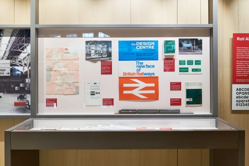
Discover how typography and wayfinding systems are designed. Starting with initial drawings and proposals, to familiar finished pictograms and transport signs, visitors will be guided through the display with commentary from Calvert herself. Featuring hand-drawn process materials; insight into early projects that shaped her design process, including her first commission; the original British Rail corporate identity manuals; 3D flythrough and a bespoke suite of pictograms for Network Rail’s new wayfinding system designed by Spaceagency using the new Rail Alphabet 2 typeface; and Calvert’s personal projects, such as special edition road signs starring Disney characters and the ‘Woman at Work’ print for Jealous Gallery & Print Studios.
Visitors will get to know Calvert through three timeless typefaces: Rail Alphabet, designed by her in the 60s and used in railway stations and on an array of rail related material; Calvert, her iconic face used for the Tyne & Wear Metro and the identity for the Royal College of Art; and Transport, for the UK road signs which, despite minor modifications, are still in use today. New Transport, a commercial face, was designed at a much later stage with Kubel. It is now the official face for the Gov.UK website.
Margaret Calvert said: “It’s been wonderful for me to have been given a chance to re-visit the original Rail Alphabet, designed by me in the Sixties, as a starting point for the design of Rail Alphabet 2, for Network Rail, which will be used for both wayfinding, and as a text face for specific publications.”
Deyan Sudjic, Director Emeritus of the Design Museum said: “Margaret Calvert showed Britain the way into the modern world. Her brilliant signage system made sense of the new motorways in the 1960s, welcomed us into a generation of new NHS Hospitals, and guided us through brand new airports and railway stations.”
Sir Peter Hendy CBE, chair of Network Rail, said: “The original rail alphabet designed by Margaret was an enduring design icon of the 1960’s, and heralded the rebirth of the modern British railway system. She is a true pioneer of design and I’m delighted we’ve been able to work with her and Henrik Kubel on Rail Alphabet 2. There’s a muddle of different fonts used on railway signage which are hard to read and confusing for passengers, so we were keen to work on a clean and consistent design to make journeys and stations better. This is just one of the ways in which we are taking a fresh, collaborative approach to design and putting passengers first.”
Follow the design story behind the railways from the 1960s to the launch of Network Rail’s new custom typeface, Rail Alphabet 2, which will be used in their design publications and eventually sign all Network Rail managed MARGARET CALVERT: WOMAN AT WORK 3 stations. Learn more about wayfinding as a design field and how new systems are designed to create a safer and more inclusive travel environment. Explore the creative processes that led to the Rail Alphabet typeface; and see how rail signage, printed matter and station architecture have changed for the present day.
Due to COVID-19 restrictions please check the Design Museum website for specific booking information.